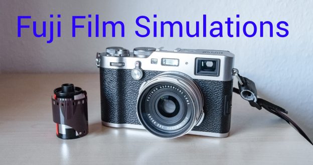
The film simulation feature is available in many Fuji cameras. This blog provides the X100F perspective as that camera is my only Fuji.
I shot on 135-format film for some years, using a Samsung compact. Agfa and Kodak films were the brands I used the most. Once or twice I bought a Fujicolor roll, but don’t remember which type. This blog cannot comment on how close the Fuji film simulations come to a particular film, but I think it is safe to assume that exact reproduction was not the goal in the first place. That would limit the capability of today’s image sensors.
Simulating outdated technology?
Calling Jpeg profiles “film simulations” has some advantages for Fujifilm:
- A camera review could criticize an altered image output because it is not accurate. With calling the output a film simulation, the company can say that neutral reproduction is not the goal anyway.
- The manufacturer can use actual film brand names for the simulations and utilize this in marketing in order to improve the perceived quality and tradition of the camera.
Theorizing about this feature might be fun, but I like to look on the practical side.
When things are black and white
Even monochrome film types are simulated. Sepia is an option I practically never select. I also find little use for the standard monochrome simulation: Texture can be a bit soft, which could be helpful for certain portraits, but shadows are too dark for my taste.
The Neopan Acros simulation is different, with superb brightness gradation. Texture resolution is insane, though images are always a bit noisy. But it is difficult to tell if that is already noise, or still detail. The noise can also be considered dithering to get more apparent levels of brightness than possible with 8-bit pixel depth.

Both standard monochrome as well as Acros simulations are also available with a digitally applied Yellow, Green or Red color filter. The yellow filter can create nicer portraits. The green filter emphasizes freckles which looks good depending on the model. The red filter darkens a blue sky for dramatic landscape impressions. I usually prefer the non-filtered image.
Color film simulations
Pro Neg Standard shows natural contrast, the colors are not overdone either. I seldom use this simulation but when I need it, I am glad it is there. It can be selected in dimly lit rooms as this image shows, because dark parts are still visible.

Pro Neg High has much darker shadow tones and more color saturation. Skin is still a bit pale, color still not overdone, and the images have a premium appearance. I save this simulation for when I am a wedding guest. I am not sure if the Pro Neg High version is based on a different film type than Pro Neg Standard, or if the camera just applies some enhancements a typical customer would like to see. For portraits with Pro Neg High, I set the shadows to -1, making them brighter.
Classic Chrome looks quite different. Color is subdued, with a distinct representation of blue and brown colors. I think the secret of Classic Chrome is that it does provide a traditional feel. Every photo, even if shot yesterday, looks like a document of history. I am not sure how this simulation is implemented. Simple desaturation does not get one the Classic Chrome output. It looks a bit as if the monochrome part of the image information was processed separately, allowing very good brightness-based detail resolution, but I don’t know how it is actually done. This simulation is on my shortlist when I visit cities or old buildings.
The Astia/Soft option is not soft, but other simulations are harder. I sometimes use Astia for landscape or gardens. Images can get a yellow cast, which makes it not the optimal choice for portraits. I like the contrast curve of Astia, with the shadows not too dark.
Velvia/Vivid has loud color and dark shadows. Velvia images are borderline exaggerated and don’t try to get a mathematically exact representation. But a sunset looks quite scenic. Cities at night can look good, too. Generally I like to use Velvia for short photo series when each one of the few photos has to make an impact.

A good standard
Provia/Standard is the best film simulation in my opinion, because it can be used in almost any situation with satisfactory results. Even though called “Standard”, Provia is not neutral. The color and especially green is bit too saturated and shadows can be too harsh. Blue colors can have a slight purple tint, which balances the deep green. All this supports the robust appearance. If you remember film prints for the average consumer, those also tried to impress with increased contrast and slightly oversaturated color. Provia seems to be a remembrance of that.
Color set to -1 provides a more realistic output. Tackling the shadows is difficult. The Provia shadows are generally helpful to provide a sense of depth. But if some part of the image is brightly lit while large parts of the image are in the shadow, this approach fails as too much of the image gets too dark. A -2 shadow setting can result in a washed-out look which is especially problematic when photographing grass or foliage. Normally I use -1 as shadow configuration.
Instead of playing with the highlight setting. I prefer to increase the dynamic range. The auto-range mode selects either 100% or 200% depending on the image, 400% is available as a manual setting. Shadow parts might get a bit noisy, but it saves highlights from overexposure. My favorite dynamic range setting is the auto option.
This image was shot with Provia default settings. Not bad for iso 12800, I would say.

Choosing a simulation
When I just want to take a photo without having to think about specific image settings, I use Provia. It provides nice results for landscape, and cities, and portraits, too. Inside a house or outside, on a beach or on a mountain, old men or young ladies, the Provia simulation covers it.
Thinking about other “film” properties beforehand helps to make up the mind: What do I try to get? Realism or expression? A natural look or romantic mood? Do I want to convey information primarily with color, or with lightness? Once this is clear and the camera accordingly set, it is easier to approach subjects and take a photograph with confidence.
Using one configuration for the whole shooting results in a coherent look which is helpful to tell a story. I find this more important than having individually perfect images.
As the Jpeg format limits post-processing options, post-edit sessions are automatically shorter. I use the free time to think about photography instead of honing my skills as a digital artist.
Does the X-Trans sensor help?
Not all, but many Fujifilm camera models including the X100F use sensors with a non-standard color array. Fuji labelled that “X-Trans”. Claims of better resolution seem arguable, I would say that there are certain advantages, but X‑Trans might not necessarily be better overall.
However one has to give Fuji this, they thought the film simulation feature through. Ordering the X-Trans color mask not as regular as on a standard sensor is a bit closer to chemical film which has a fully random distribution.

Using an X-Trans sensor implies a different algorithm to demosaic the image, and to deal with different artifacts. The result could be closer to analogue film. This effect should be small considering today’s sensor resolutions, but it shows that Fujifilm’s effort to get a more film-like output is more than just a software trick.
The good look of high-iso images appears to be supported by quite strong color-noise reduction, removing small color details in high-iso images for the benefit of brightness resolution. This trade-off could be viewed as part of the film simulation.
The X100 series uses a fixed prime lens which has some small issues in certain circumstances, and even those contribute to a look known from the film age.
Getting colors right
Auto white-balance can be off when one is surrounded by green nature. That will cause a purple tint. Experiments during a shooting with a different white-balance can take longer than doing corrections later in the post-processing. If one plans to use the image straight out of camera, it is good to know when to use which white-balance mode. When in doubt, I switch to auto white-balance.
The effect might be subtle, but monochrome images are affected by white balance, too. For color images, white balance shifts can be used as a creative tool, but I prefer colors which look right.
Provia, Pro Neg, and Classic Chrome provide pleasant skin tones, with smaller skin issues gracefully softened. I find the skin rendering so good that I do people photographing mostly with Jpeg just because for little effort one gets quite good results.
When comparing a film simulation Jpeg with the Raw file, it becomes apparent that the camera’s Jpeg has not the full possible range of nuance. But the slightly reduced palette often supports visual communication. This is an Classic Chrome example:

Skipping post-edit sessions
Why would one pay 1400 Euros for a camera if one is not going for the best possible image quality? This was my thinking until lack of time let me ask: Why did I pay so much if I have to develop, or at least optimize all photos after a shooting?
For prepared portrait sessions I of course take the time to work on the photos, using Raw in order to keep all options. The last wedding where I was invited as a guest however I shot with Jpeg-only (Pro Neg Hi, Shadows -1). No-one complained about a few overblown highlights, everyone liked the overall appearance.
For everyday’s photographing, a Jpeg is good enough and post processing can be kept very brief. This includes travel photography where I now like to use photos out of camera with no edits whatsoever. It takes time to get the experience necessary to minimize waste. But it also takes time to learn how to use image editing software, so either approach takes time. However, the post-edit approach takes time after each shooting, while the learning-to-use-camera-Jpegs approach, once mastered, can be used with then no further time involvement, or at least reduced time consumption as edit session can be then very short.
Other camera makers provide nice Jpeg images as well. As a matter of personal taste, I like the Fuji “film simulation” rendering a lot, where the camera does a lot of useful post-processing automatically for me. Doing little or no edits afterwards means to give up some control, but it also means to enjoy the photos with less delay.
That approach has obvious limitations, but some advantages as well:
- Keeping the Jpeg settings the same throughout an event ensures that the series has a consistent look.
- No post also means no cropping. One has to consider image composition more carefully. This could lead to better photographs, but the main advantage is that I look at the world with more attention. And return with more and clearer memories.
- Beside image composition, using exposure compensation when shooting in twilight takes more time as well. But it is a lot of fun taking photographs without piling up work for later when coming home.
Learning to accept small imperfections which could be easily edited out, was the hardest part for me. Now that I do some portion of my photographing with straight out of camera Jpegs, I feel that is is useful to learn to focus on more important things before worrying about possible small mistakes.
Except for the headline image, all photographs in this blog are created using only the camera.

I shoot raw but still preserve the film simulation settings.
The way to do this is to use Fuji’s raw converter software in your workflow.
This needs the camera to be connected and processes the settings you pick on screen using the cameras engine to convert to JPEG.
For me this is an ideal workflow. When I shot JPEG only I sometimes forgot or didn’t have time to switch to the right film simulation. Now I can correct this afterwards.
Hello Barth,
I personally find it too much work for regular use (take out of leather case, connect, disconnect, put back into leather case) but I use it for batch conversion if needed. Also it is nice to see how it looks like before creating the file.
Pingback: Two years of the X100F | Arne's blog
Sehr interessanter und differenzierter Eintrag über die Filmsimulationen! Da hat sich jemand mit dem Thema auseinander gesetzt 🙂
Ich überlege immer noch, ob sich eine X100F lohnt, wenn ich doch eine Sony A6000 mit superscharfem Zeiss Objektiv besitze. Technisch sind die Sony’s super, aber die JPEG Ergebnisse und die Haptik befriedigen mich am Ende nicht wirklich und meist bleibt die Kamera mit Objektiven aufgrund der Größe dann doch zuhause. Eine wirklich vergleichbare Linse (Brennweite/Größe) gibt es im Sony Bestand glaube ich auch nicht. Andererseits: rd. 1000 Euro für eine (gebrauchte) Kamera ohne Wechselanschluss? Und mir zwei Kamerasysteme zu leisten bin ich dann doch zu knausrig… 😀
I just saw the comment, sorry 🙁
Personally I like to have different cameras for different purposes. Currently I use a DSLR if the camera needs to be flexible, and the X100F if I need to be flexible.
Of course, money is always a consideration.
I created a book with sooc jpegs using the in-camera raw converter and the print was outstanding. I added saturation back into the Classic Chrome profile for a unique yet still realistic look.
The best solution for what you are looking at is to shoot Raw+Jpg. You only use the JPEG files except where an image has blown highlights, poor WB etc, then use the in-camera raw converter to quickly and easily fix those few images. No computer editing required
That’s what I ended up doing after a few years Fujifilm indeed.
Thanks, I enjoyed reading your blog!